OVERVIEW

Project
The live Small Business view all cards page was very long and not scannable, this created a low conversion rate on the cards further down the page. To create an easier and more digestible page for the user.

Role
Sole designer working with the Agile team to design a more “Pinterest” style approach.

Timeline
2 months

Target Demographic
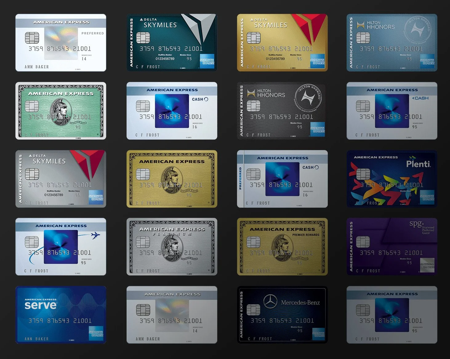
Small business credit card users.
USER TESTING
Before I was asked to be the lead UX designer on the design scrum, they took the initial concept I had and another designer worked on it for usability testing. This lead to mixed results with about 70% of users enjoying the clean minimal design that the designer had created based on my concept I had pitched them prior to joining the project. The users didn’t understand the icons that were in this design, instead of words to describe the cards.
The concept the designer had was that it was more scannable as most users don’t want to read a lot of information. But since the average age of someone looking for a small business card is closer to 35 to 45 years old, the users we had testing wanted there to be more information before being taken off the page to the product detail page.
Taking these learnings, I was brought in to take over the project to work through the issues brought up in usability and to help work with the marketing team for a better user experience.
First Step
When I started designing the View All Cards page in the Agile Marketing Scrum, I started with research on what other websites were doing and noticed the easy use of the Pinterest website.
Then I started to draw out an idea that I had been inspired by the design of Pinterest to create an easy interactive experience.
These tiles would start in a collapsed state to have a more digestible amount of information upfront to help the user have an easier time scanning the page for the card that best fits their needs.
Once the user sees a card that they are interested in, they could expand the tile to view more information about the card before going to the product detail page to learn more about the benefits of this card.
In the beginning, I iterated on the tile design and layout of the condensed card tile. Once I narrowed it down I started going into how it would appear in both the condensed and expanded state. Also going through the designs of whether they should be lined up or be flexible based on amount of text. The flexibility would allow for the Pinterest style, where users can expand only the card tiles they’re interested in reading the full Welcome Offer as well as the APR and more benefits before they open the product detail page.
We went in the direction of less is more as well as moving the annual fee to be under the benefits and perks of the card so the user can first see what the benefits are before they see the price. The higher the price is due to the better benefits for small businesses.

First Iteration
Once the results from user testing came back, we started a new scrum where I was the lead UX/UI designer.
Working with the marketing team as well as the scrum master and the product manager, we started working through the Pinterest idea more in depth.
I worked to create a new version that was more aligned with what users and stake holders wanted.
Final Iteration
The resulting design were taken well by the VP of Marketing as well as the head of the agile scrum marketing team.
A learning from this design iteration was that we should have brought in developers sooner, as this design would have cost too much money to develop based on time spent building.
In the buildkit, I also include a breakdown of the new elements and how they function.
Also in the scrum, we wanted to also work through flags for all these breakpoints.
As users have come back saying that the live flag on American Express’ website looks like a button and takes them to the product detail page where they lose the welcome offer detail as it isn’t separated on the current page.
This redesigned flag actually looks like a flag instead of a button.


