
overview

Project
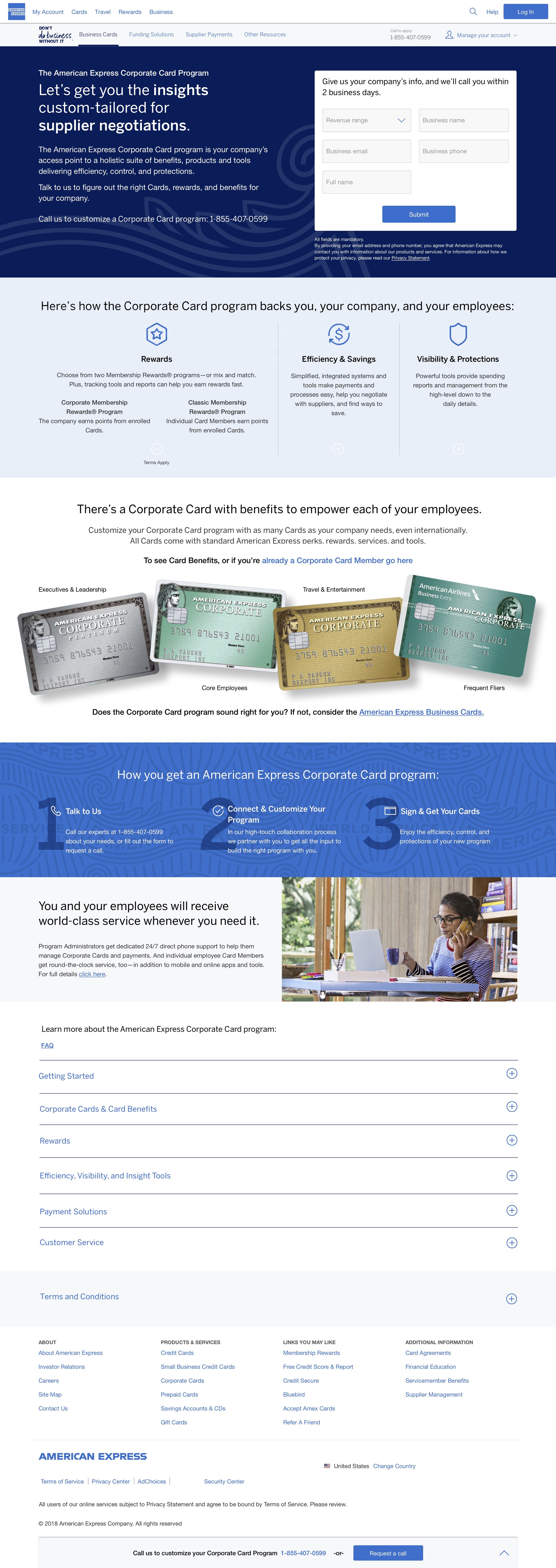
The corporate card program remains the sole page that demonstrates what the corporate program entails on the entire American Express.

Role
Sole designer creating MVP version of corporate category page working with product manger and marketing stakeholders.

Timeline
1 month

Target Demographic
Anyone trying to find out more information about the corporate category page ie program admins and people looking for benefits of credit card.
PROBLEM
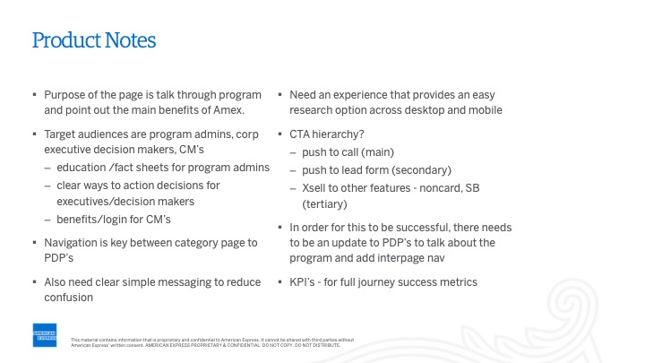
With less than 1% of users managing to interact with the right rail sticky as the primary form of the key performance indicator (KPI), the project was then carried out to redesign the page to help users understand the program.
The KPIs would remain the same; maintaining the lead form submits, and phone call leads, and since they cannot make online application, it was imperative to make that consistent.
The Definition corporate program, and Its Ideal Users
The corporate program encompasses all the things users can do with their corporate cards.
The program is beneficial to cardholders and also program administrators. In theory, the program can turn off somebody's card if it realizes that it's being misused.
Users who search for only the benefits of the cards are led to this page instead of the individual cards.
RESEARCH
I found more inspiration from looking into the work of different competitors in the fin-tech space as well as other competitors like Uber. I used Nerd Wallet, Perkville and Uber in my presentation to the team and the stakeholders appreciated and liked the examples from Uber and Perkville because they were easy to fill and the forms were located on the right side.


DEFINING THE MODULES
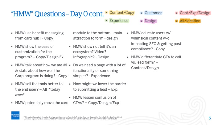
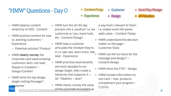
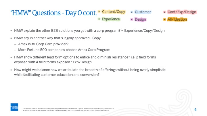
The process of defining the modules involved a sit-in of me and all the stakeholders of the page, i.e. the product, marketing, SEO, test and learn, copy, and analytics.
We all sat in a room and determined the most important modules and the order in which they would appear.
After that, I made two versions of the modules; A and B. Version A was to be tested against the current page while B would be tested via a rapid lab user testing, but eventually, the two versions were tested against each other.
WIREFRAMes
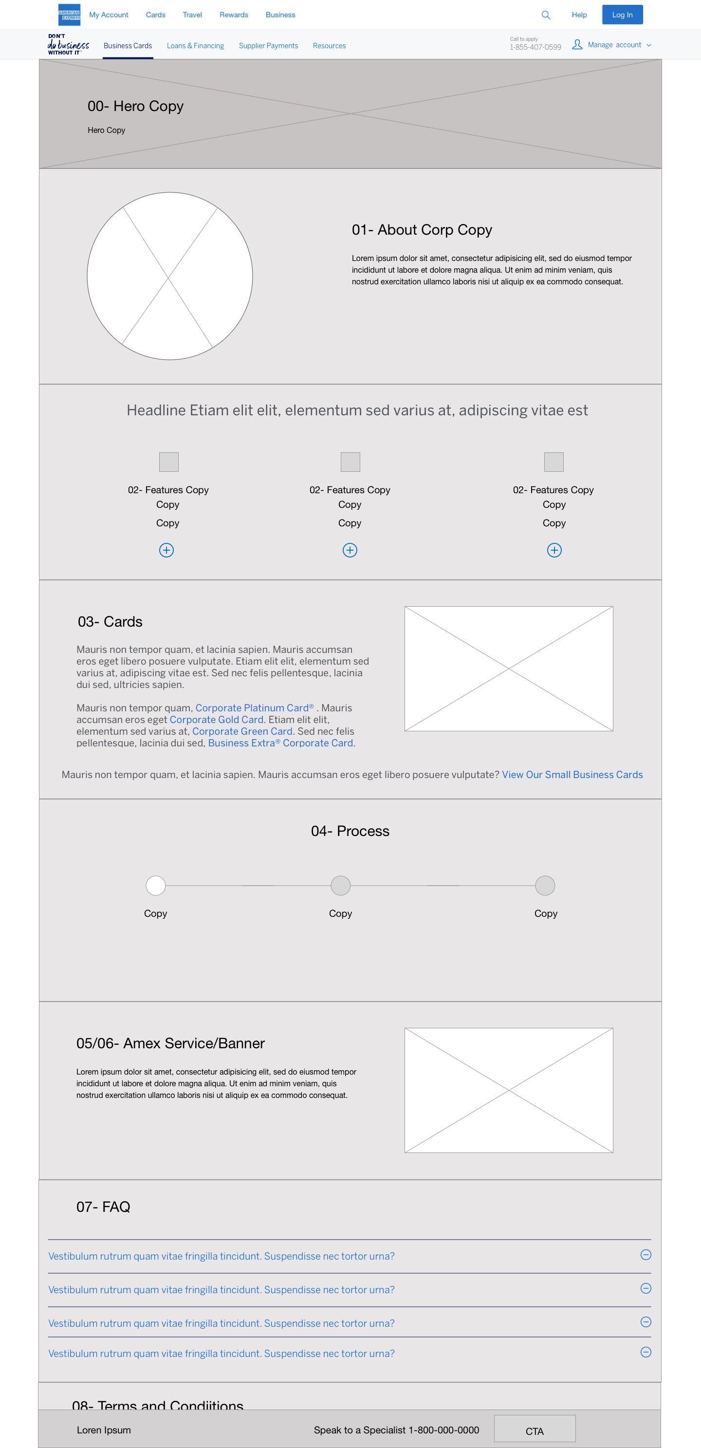
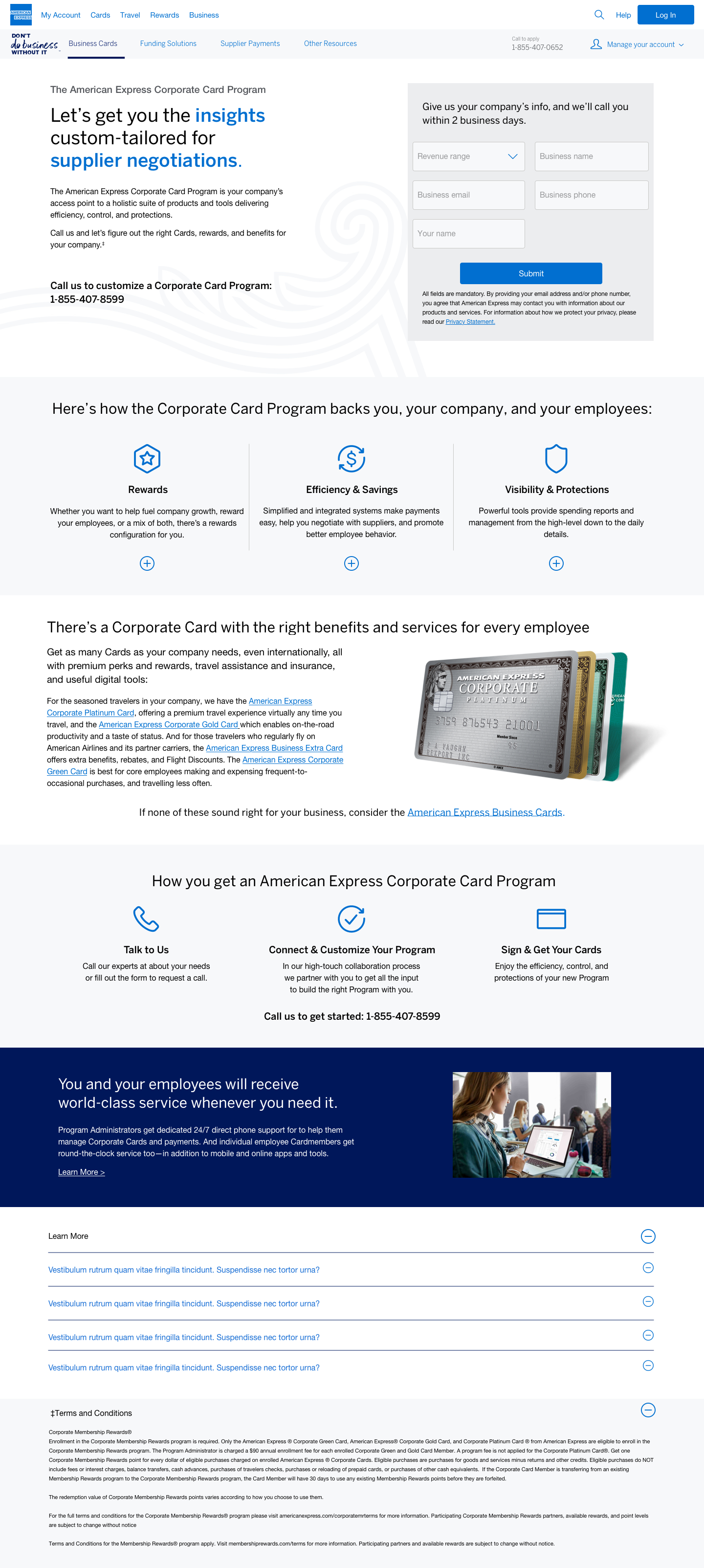
I would then come up with five different versions of the page on wireframes.
Together, we decided that the hero would not be necessary for the page and the form on the right along with the text on the left would be enough for users to understand what the corporate card program is and how it operates.
If the users wanted to get in touch, they would submit a lead form.
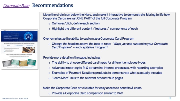
The plus sign features used in the previous pages were a new, reusable and innovative component for the American Express website.
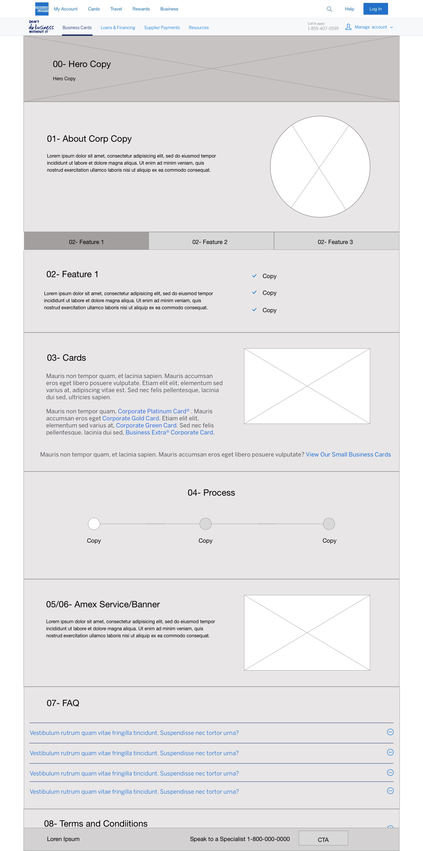


Mid fidelity comps
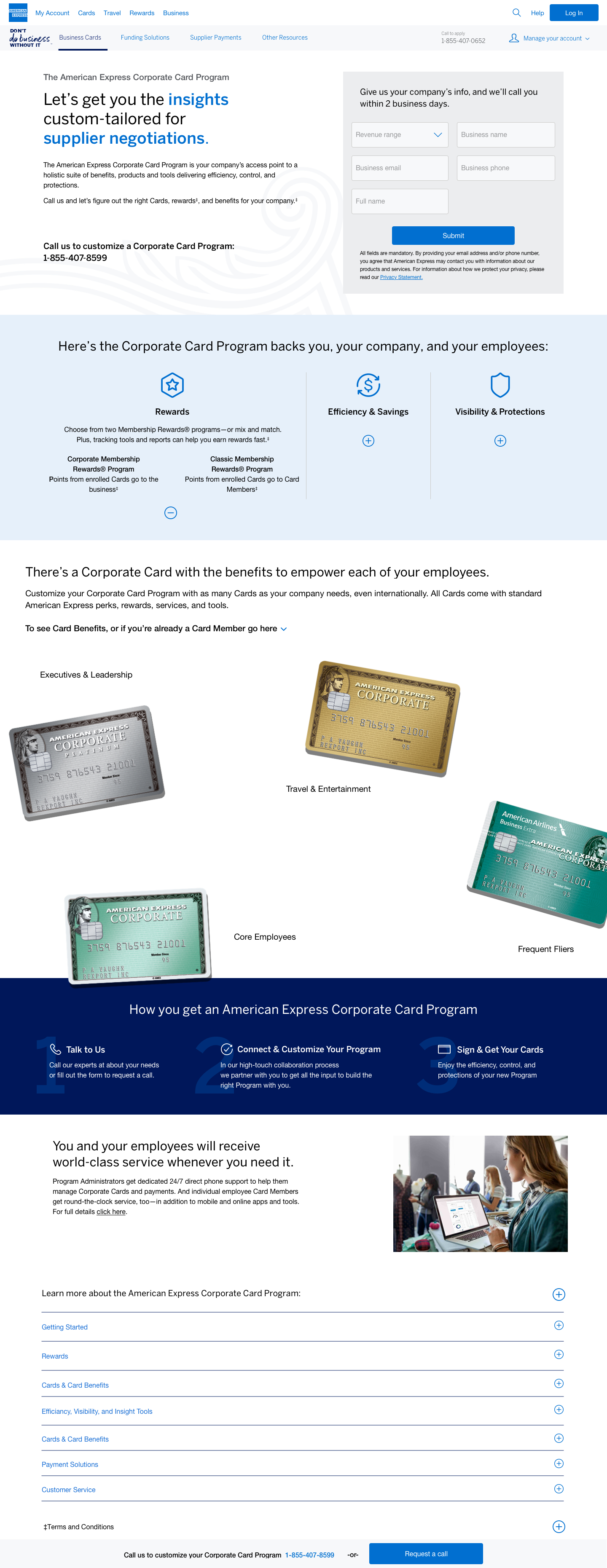
The next step was to show the stakeholders the layout of the page, and their output was as follows:
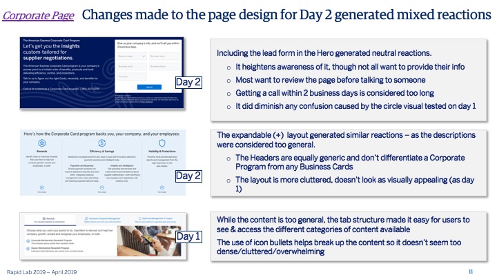
The module on the far left did not represent the cards correctly, and the texts would confuse the users. This module had cards stacked together.
I made various modifications on various aspects of the modules. For instance, the process section on the bottom and the lead form on the top, which was shrunk down to make it less noticeable on the top and make the texts fit in.
The stakeholders chose the module in the middle; it has a blue background and a watermark to make the page pop more about the actual process on how to get a corporate card.
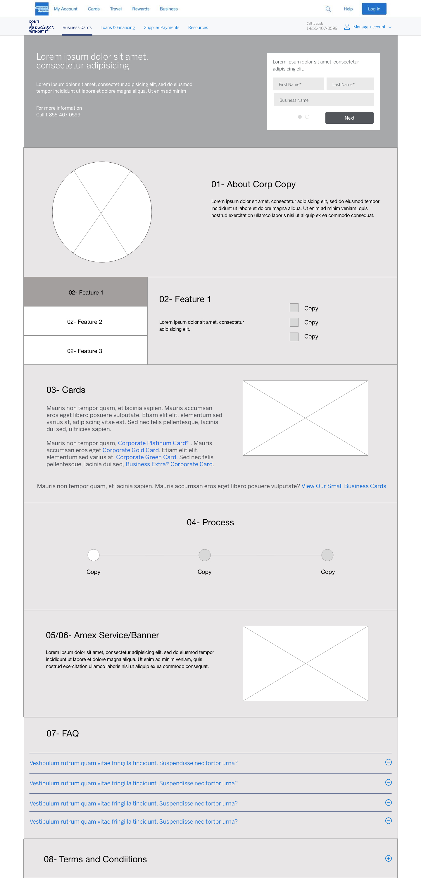
HIGH FIDELITY Comps
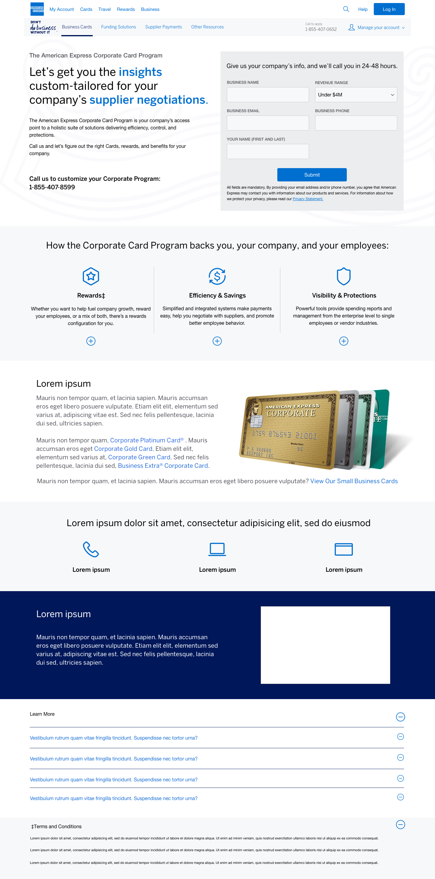
The team would then tighten up all the spacing and enhance the flow the page chosen by the stakeholders (version A). These modifications included:
1. Changing the top module to blue with the headline American Express flourish. The underlined words in white are dynamic; they change after every few seconds like those in https://codyhouse.co/demo/animated-headlines/index.html
2. Slight changes to the feature module were the addition of plus and a minus signs to differentiate the various features.
3. A complete change of the cards module; the new version incorporated a layout of the cards and the individuals that the cards would best suit.
4. The process module was changed to a different shade of blue with a watermark.
5. Why Amex? The picture was also changed to a freelance woman.
We also added a bottom sticky nav that would pop up like a toaster as seen in the example. The nav would also scroll down with the user if the user does not want to fill out the lead from at the top.


USER TESTING INSIGHTS
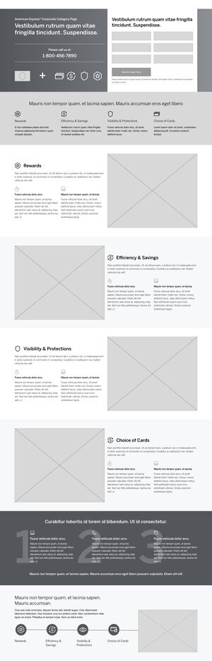
The original design included card art. Once the user saw the card art they would try to click the cards to learn more about each card or to compare them but with the Corporate Card Program the user can’t choose their card online.
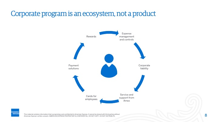
The users wanted to also interact with the ecosystem that was non-interactive in the hero, this lead to dislike amongst the users because they expected they’d learn more information.
Sketches
We started with sketches with the Director of UX, creating new iterations right after usability testing and moved forward with removing the card art and creating an interactive ecosystem. Also started sketching through how the different modules in the design could look on their own and in the layout.


Iteration from User Testing
Once the team went through sketches and discussed the feedback from usability testing, I started working on wireframes to iterate on the updates. These versions of the wireframes played around with different layouts of the design and how the content is displayed.
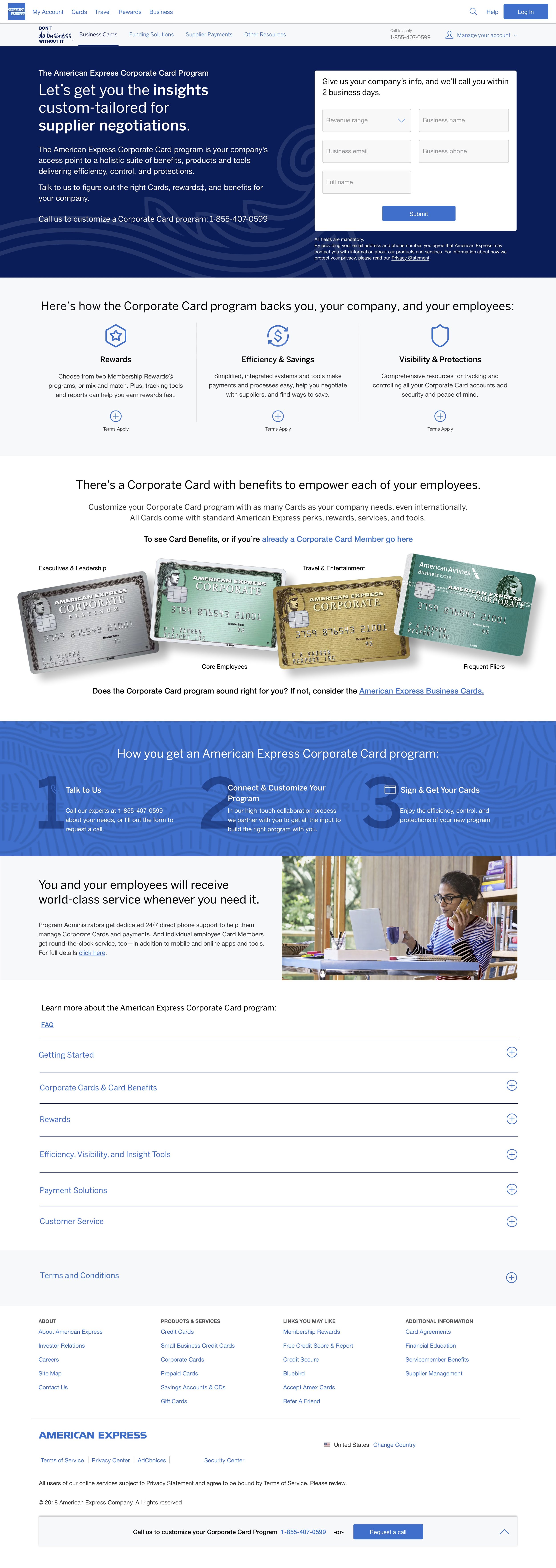
Final Version
When the agile marketing team went through these wireframes and decided to move in a specific direction with the interactive ecosystem. The user can click on each of the icons in the ecosystem and the circle will rotate with the information also revolving as well. Arrows on either side of the information that is in the ecosystem that they can also revolve through and the circle will also revolve. In the hero the bold text in the header will also change out every 5 seconds.
When the agile marketing team went through these wireframes and decided to move in a specific direction with the interactive ecosystem. The user can click on each of the icons in the ecosystem and the circle will rotate with the information also revolving as well. Arrows on either side of the information that is in the ecosystem that they can also revolve through and the circle will also revolve. In the hero the bold text in the header will also change out every 5 seconds.
Learnings
After the page was built and went through live A/B testing, they ended up getting taken this version down due to analytics coming back with data that shows a lack of interaction with the page. The learnings we got from this page shows that the card art was something users liked to see so they know what card options are available.