
OVERVIEW

What is ShopRunner
Building a differentiated brand. The mission of ShopRunner, an e-commerce delivery company, is to set the bar for post-purchase experiences. ShopRunner has always had an egalitarian spirit that embraces the weird, wonderful, and passionate. But for many years, ShopRunner has found itself in the shadows of their partner brands. We decided it was time to change this. The spotlight is on ShopRunner now – we’re creating a distinct, quirky personality and brand identity, that will turn heads and deliver a best in class post-purchase experience

Role
Working with product, marketing, developers, and other designers to come up with MVP version of new PLP and PDP pages.

For who: Everything Internet Shoppers
Women who love to shop online. They love browsing for deals, for ideas, for gifts, for pick-me-ups. They are deeply immersed in internet culture; sharing gossip, memes, lists, and gifs to connect on group chats and even with their kids. They shop as a pass-time, a sport, a way to lighten up their day. BUT, their joy for shopping is seriously threatened by bad post purchase experiences, and the confusion that comes from unclear returns and processes.

The Challenge
The e-commerce world is full of wildness, spontaneity and amazing brands, but consumers are constantly disappointed by the process of the experience. With unlimited options; numerous retailers, many payment options, specific return policies, multiple packages and different carriers, the list goes on…it all throws consumers into a state of total chaos.
Looking into data
How can Shop Runners position themselves in a better way?
competitive analysis
I looked into similar e-commerce website to see how they compare and contrast from ShopRunner to create an informed decision using ShopRunner principles from above.
Adding badges i.e. free returns or being called out more to entice customers to buy items
Multiple color options for same product
Visible Filter Options- option to filter by specified delivery prioritized
Recommendations vertical placement
Loyalty Program
Wireframes
From my competitive analysis I came up with a few versions of wireframes, and from there comps for unmoderated user testing.


assumptions
Customers would like to add items to shopping cart on Shop Runner website instead of taking multiple steps to get to retailer page.
Customers would like to click on sizes and colors on PDP pages, and for them to translate on retailer page.
WHAT ARE WE TRYING TO UNDERSTAND?
User sentiment regarding three similar, but slightly different PLP and PDP experiences:
Experience 1:
Reflects our existing experience: when a user clicks or taps a product card on our PLP, they are taken to our PDP where they can click “Visit Shop” to be taken to the retailer’s PDP.
Experience 2:
A variation of our existing experience: when a user clicks or taps a product card on our PLP, they see a PDP modal where they can click “Visit Shop” to be taken to the retailer’s PDP.
Experience 3:
A new experience: When a user taps or clicks a product card on our PLP, they are taken directly to the retailer’s PDP.
TESTED WITH 7 INDIVIDUALS
The majority preferred Experience 3, which takes the user directly to the retailer’s PDP on click or tap of a product card.
“Straight to Bloomingdale’s makes more sense.”
“Thought it would lead me directly to the website (Bloomingdale’s) in the first place.”
“Found this much better. ‘Shop Now’ step is strange. Eliminate this step.”
Between Experience 1 and 2, there was a slight preference for Experience 2 (the modal experience).
There was some confusion from users regarding whether they were still in the ShopRunner experience when they navigated away from shoprunner.com.
New User journey from testing
Introduces a way for customers to sign into or sign up to ShopRunner accounts to check out on the retailers product detail page.
Cross shop modal to see the product in a smaller view with recommendations when they go on retailers product detail page it would open in new tab so if they do not like that product they would be able to return.
Leaving full product detail page for SEO purposes.
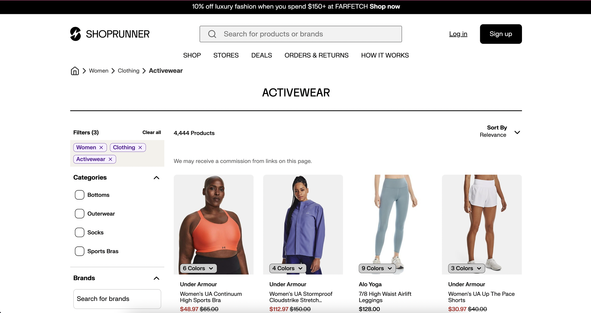
Product listing detail Comps for developer handoff
After testing product, developer and design stakeholders decided for the MVP version launching in early 2023 to update this page by updating:
Useing library components to add a detailed view of filters for desktop, tablet, mobile breakpoints.
New iteration of badging (2-free day shipping, free returns).
New breadcrumbs and title of page look and feel
PLP Differences 2022 vs MVP 2023
Adding new badging at the bottom
4 products across vs. 3
Smaller card times
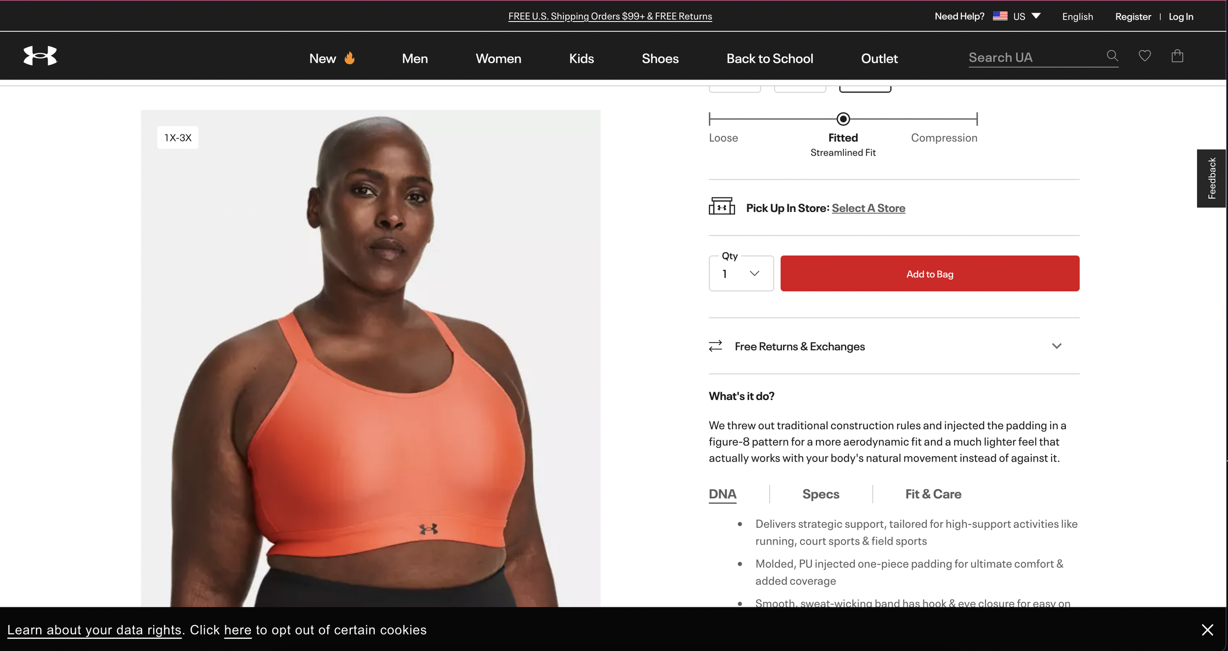
Product Details pages Comps for developer handoff
After testing product, developer and design stakeholders decided for the MVP version launching in early 2023 to update this page by updating:
Using accordion component to separate information (colors, sizes, product info, shipping and returns)
New views of images in carousel or slide version on mobile
Content is being provided from a content management system so each item is different in what is being provided from each retailer
Pdp Differences 2022 vs MVP 2023
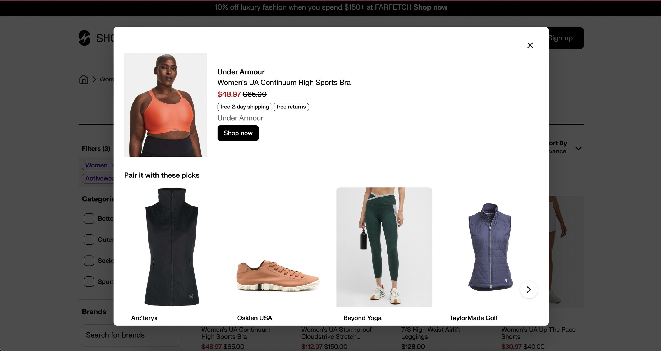
Live production site journey
Shoprunner.com (July 2023)
The work I did went into production from below. As you can see from the user journey when the user clicks into a product listing page they will go to the stores, and Shoprunner page will stay open to other relatable products.
Learnings/outcomes
One of the hardest parts of this project was to get buy-in from stakeholders since Shoprunner’s goal was to redo the post purchase experience and mobile application. We also do not have enough developers to get this developed as fast even for the MVP version so creating a product roadmap was more a design task.
Beyond MVP Versions
During this process we learned…
Comparing prices for the same item across multiple retailers
Do we need an “add to cart” experience? How will that help our users?