Overview
Project
Verizon's billing and payment systems show the increasing complexity of its business, resulting in a disjointed and unclear customer experience. Issues come to the forefront on the customer's next bill summary page. In mid-2023, Verizon started a planned overhaul of its billing process to regain customer trust and cut down on customer service calls by offering a transparent breakdown of fees.
Role
Work with the product owner and developers to make a design that is easy for users to use.
Timeline
10 months
Lead designer/ 2023-2024 / web, app, paper, PDF version
Target Demographic
Verizon phone customers.
Complex Billing. Confused Customers.
Verizon's billing system complexity has led to a disjointed and unclear customer experience, particularly evident in the next bill summary page.
What made this project complex and ambiguous?
Design System Integration
Evolving requirements
Tight deadlines
Multiple Stakeholders
User Testing
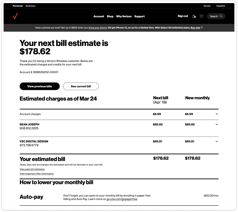
BAU - Confusing Next Bill Summary
Unclear distinction between "next bill" and "new monthly" charges
Information overload with two billing cycles displayed simultaneously
Complicated secondary sections (e.g., how to lower monthly bill, pending charges)
Potential redundancy in column information
Customers struggle to understand reasons for bill changes
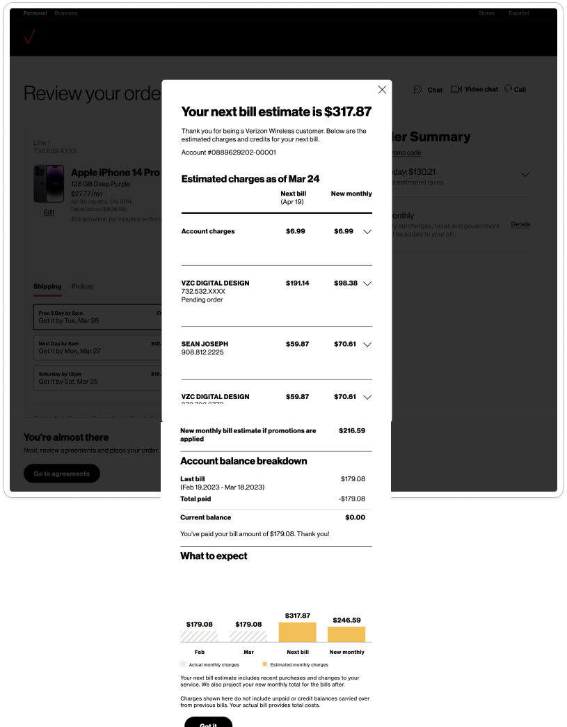
Point Of Sale - Unclear Purchase Impact on Billing
Difficulty understanding the difference between current and new bill after purchase
Confusion about why the next bill differs from new monthly charges
Complex presentation of plan changes and new device costs
Uncertainty about immediate vs. long-term billing impacts
Overwhelming amount of information during checkout process
How might we... simplify the billing information presentation to provide clarity and reduce confusion for customers, both in their regular bill summaries and during the purchase process?
Customers want side-by-side bill comparisons
Half of participants want side-by-side comparisons
Vertical format is tedious and time-consuming
Horizontal layout preferred for easier readability
Current layout requires frustrating back-and-forth
“Now I have to flip back and forth to compare. I kind of wish there was a way to do a side by side comparison because this is a bit frustrating.”
REFINED SOLUTION
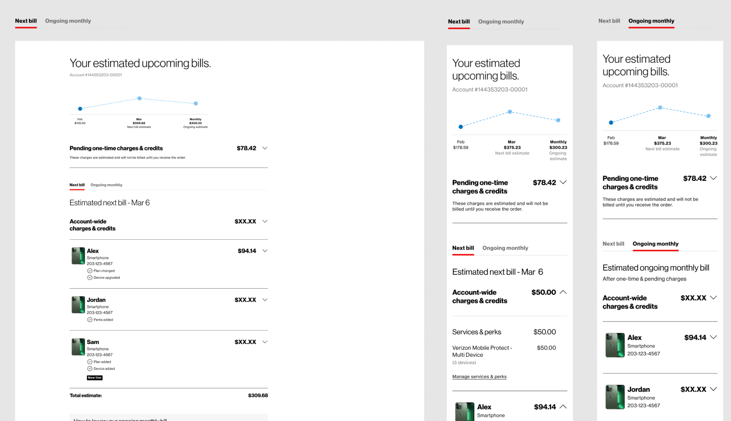
Improved the tab navigation, making it more intuitive and visible
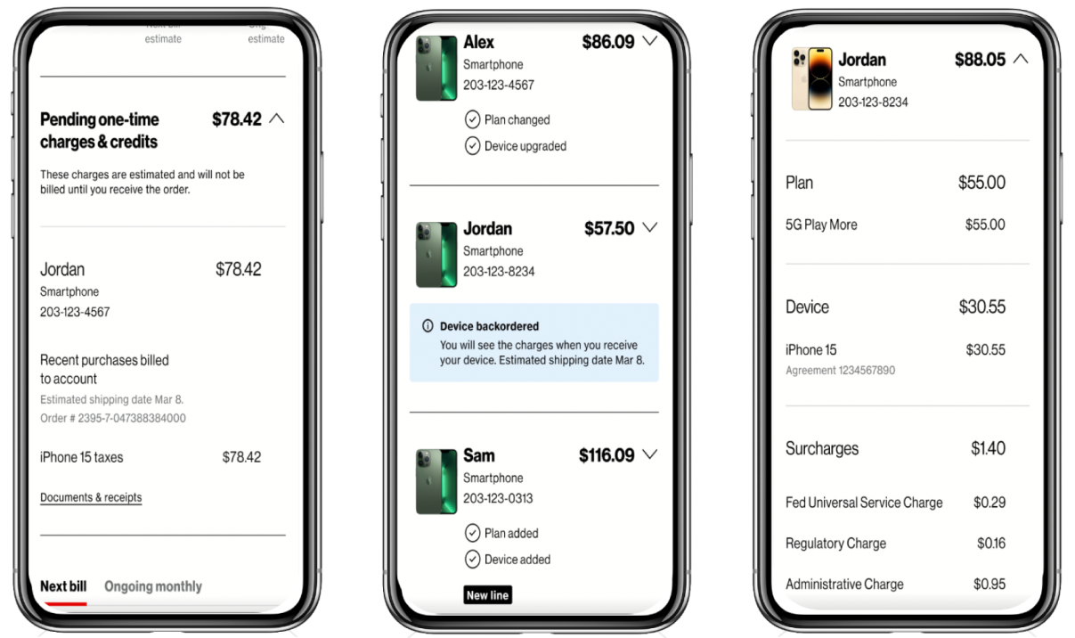
Clarified the presentation of pending charges, providing more detailed explanations
Introduced a side-by-side comparison feature, allowing customers to easily track changes in their bills over time
Quick demonstration of our refined solution in action
INsights
Navigation is more intuitive, pending charges are clearly explained and users can easily compare bills side by side
Used expandable components from the bill to help customers easily identify what they were viewing and to streamline the development process
The tab section, highlighted with an underlined red design, is also based on the design system
During collaboration with the design system team, essential to ensure that all headers, fonts, components, and spacing were implemented according to the developer handoff file and met ADA compliance standards
“I like it, phone bills can be a bit confusing so I think this page is pretty intuitive, they separate account wide stuff from the breakdowns of each of the lines, you can pinpoint an area that’s more expensive and can easily tweak it. I don’t feel like anything is being hidden from me.”
How might we... provide timely, relevant information to users without disrupting their billing review process?
Users found in-Line notifications helpful, but want more visual clarity
Found notifications helpful for understanding charges
Contextual placement reduced confusion and support needs
Suggestion to make notifications more visually distinct
“These little explanations right next to the charges are super helpful. I don’t have to guess what each item means anymore.”
How might we redesign the paper and PDF bill to provide a clear, comprehensive billing experience that aligns with our digital platforms?
Optimize information hierarchy and layout for non-interactive formats while maintaining consistency with digital experiences
Balance comprehensive billing details with space constraints and readability for diverse user groups
Ensure the redesigned bill serves as both a clear customer communication tool and a legally compliant document
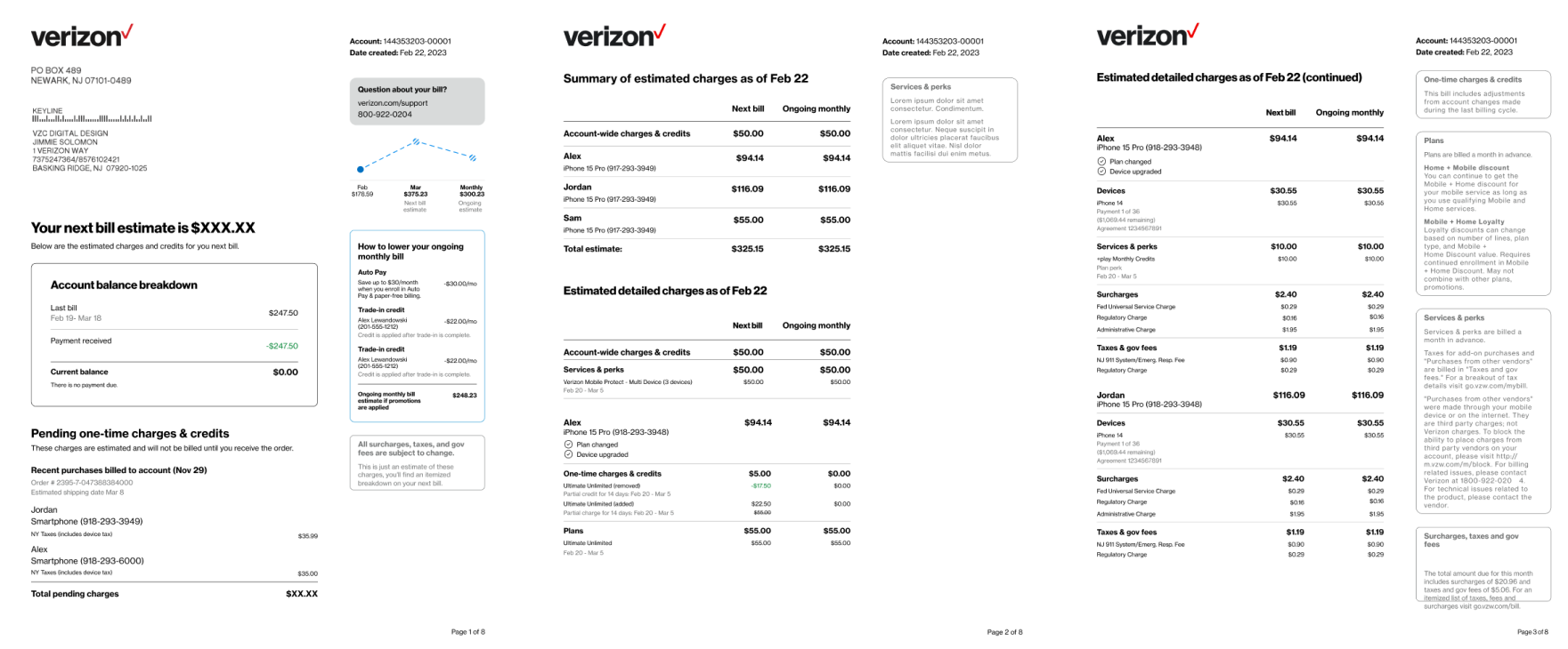
Redesigned bill addresses these issues
Introduced a 'Pending one-time charges & credits' section
Added a 'How to lower your ongoing monthly bill' section
Included a summary of charges for each line and the overall account
Introduced two columns showing 'Next bill' versus 'Ongoing monthly' charges.
These changes directly address key pain points our customers experienced with the old bill format.
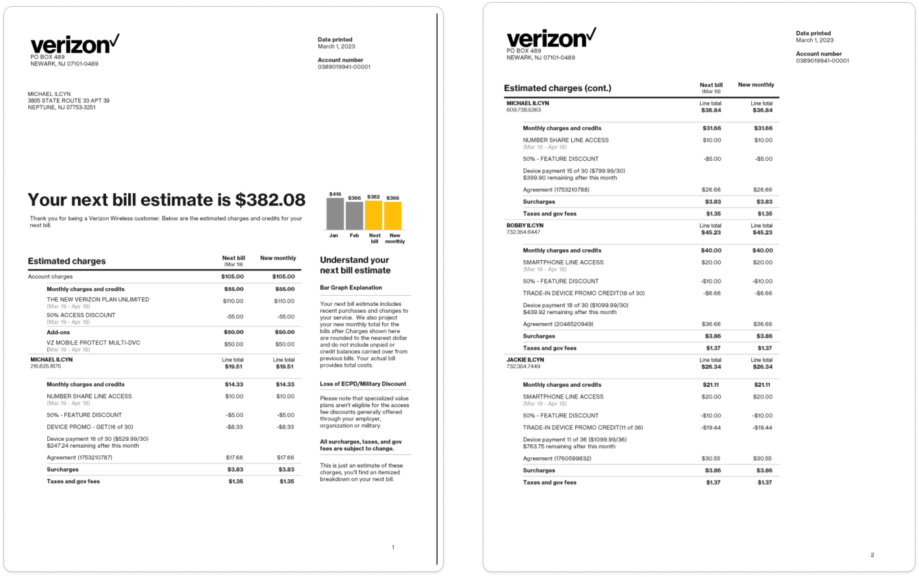
Previous design:
Contained all the necessary information
Text-heavy
Lacked clear visual hierarchy
Overwhelming- especially for customers with multiple lines or service
What were some of the constraints encountered during this project, and what are the overall reflections?
Product hadn't launched so I don’t have data on its success.
Product manager faced confusion about deadlines since stories were being developed and refined on the go
Significant pressure from leadership to complete the project quickly due to the last-minute allocation of funding
Additional time was necessary for further refinement
Overall, this was a complex project, but it was designed to be used by all Verizon customers whenever they make changes to their accounts.


