overview
Project
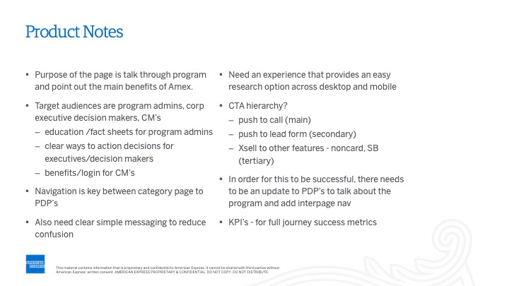
The corporate card program is the only page that shows what the corporate program includes on American Express.
Role
Creating basic version of company category page solo, collaborating with product manager and marketing team.
2019
Timeline
1 month
Target Demographic
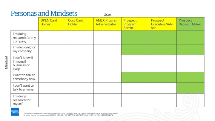
Individuals seeking details on the corporate category page, such as program administrators and those interested in credit card perks.
PROBLEM
Fewer than 1% of users successfully engaged with the right rail sticky element. Therefore, a project was initiated to revamp the page for better user comprehension while keeping KPIs unchanged: lead form submissions and phone call leads, especially important as online applications weren't an option.
Corporate program definition and its target users.
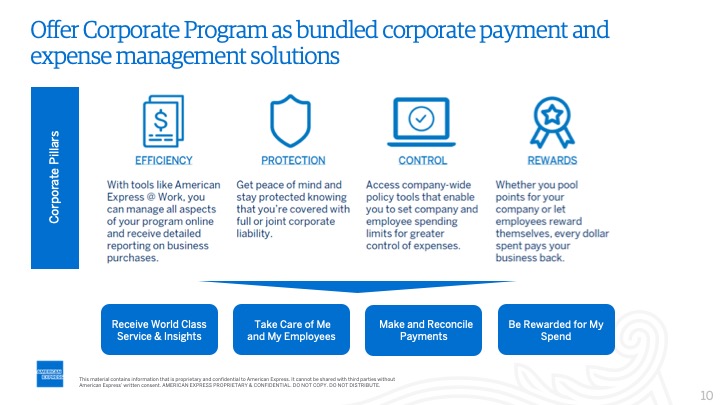
The corporate program includes card functions. It helps cardholders and administrators. It can deactivate a card for misuse. Users looking for card benefits are directed here instead of specific cards.
RESEARCH
I got inspired by checking out competitors in fintech and Uber. I included Nerd Wallet, Perkville, and Uber in my presentation. The team and stakeholders liked the examples from Uber and Perkville because they were easy to use, with forms on the right side.
DEFINING THE MODULES
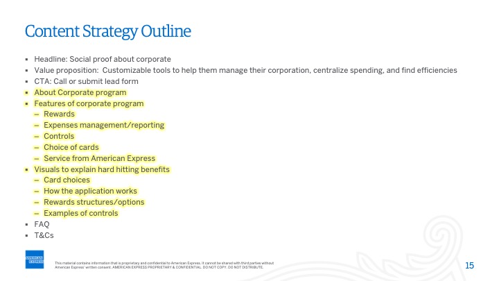
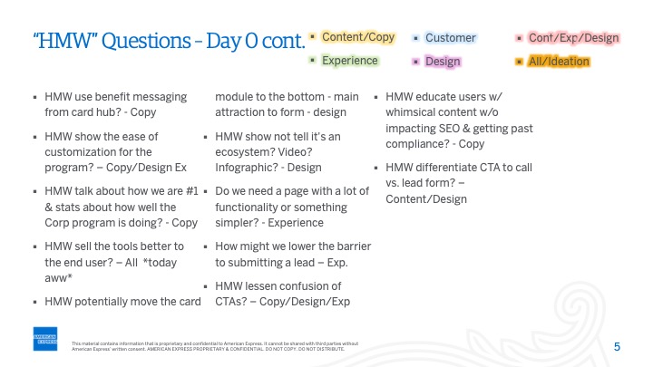
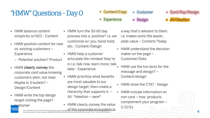
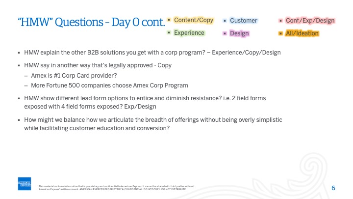
The modules were defined by discussing with all key stakeholders including product, marketing, SEO, testing, writing, and analytics teams.
We all gathered in a room and decided the key sections and their sequence. I created two module versions: A and B. Version A was tested on the current page, and B was tested in a quick lab user test, but both versions were later tested against each other.
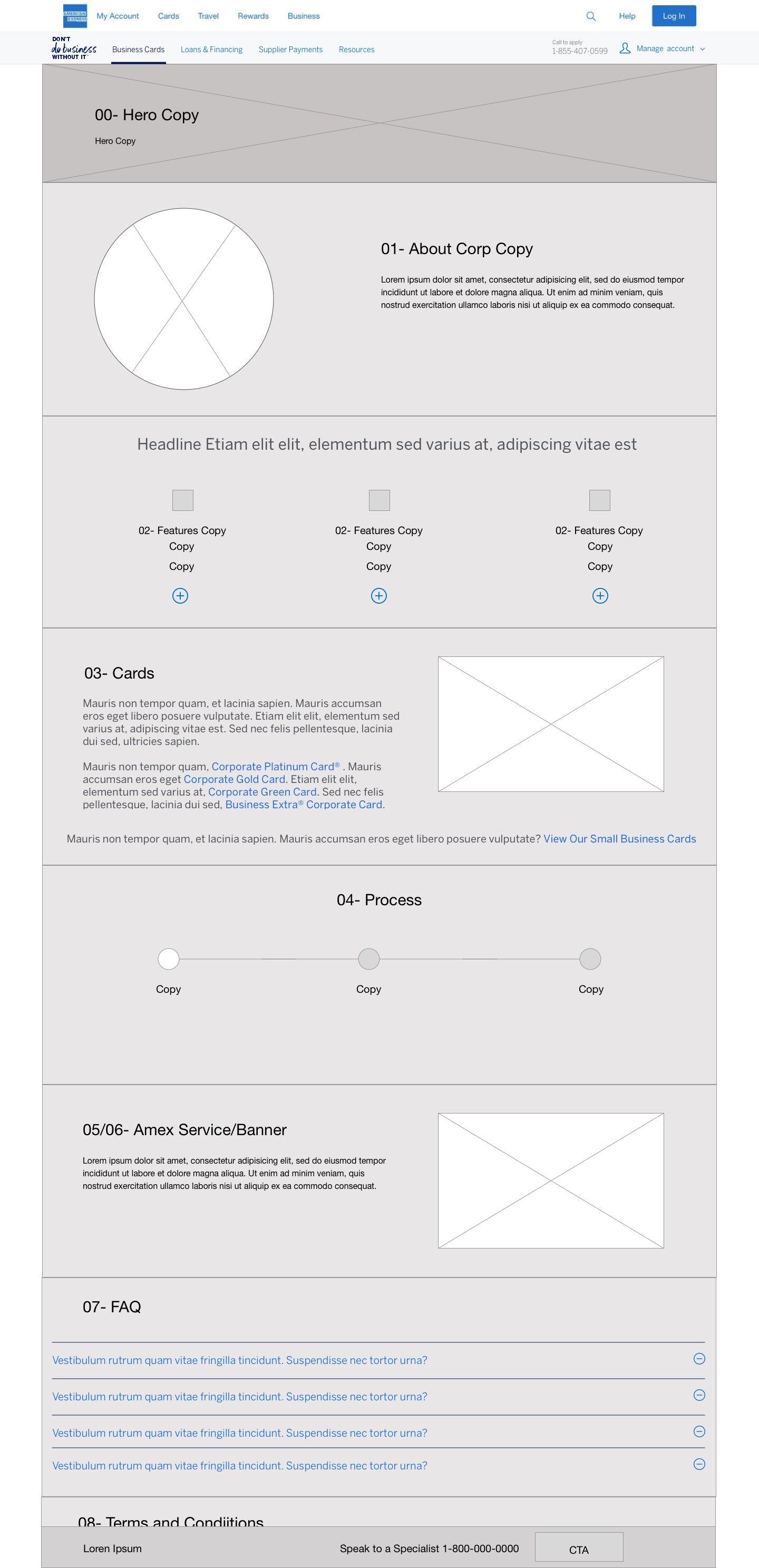
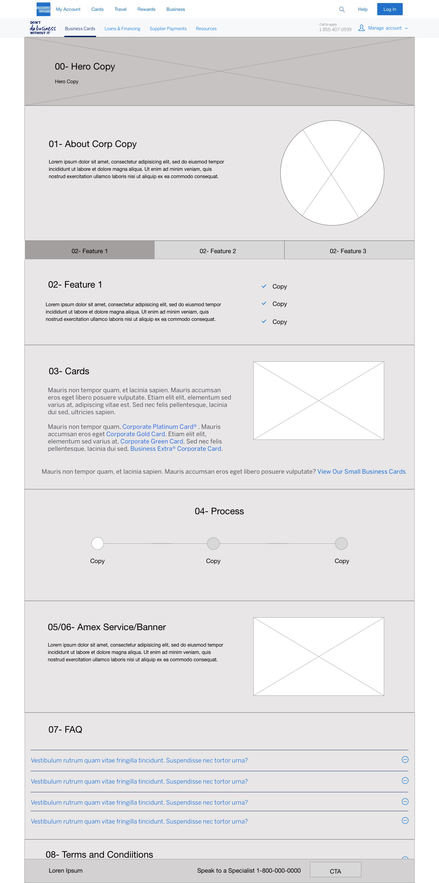
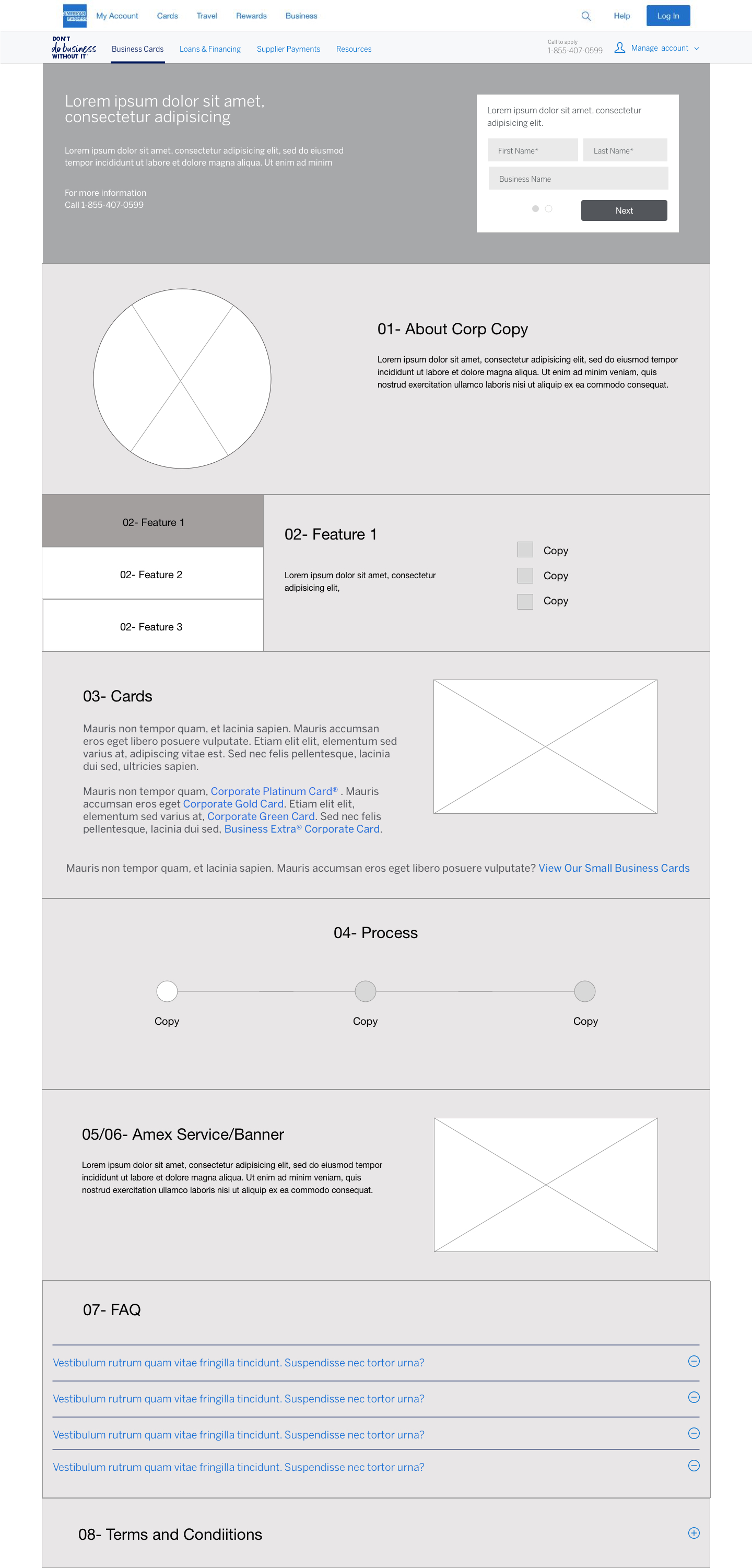
WIREFRAMes
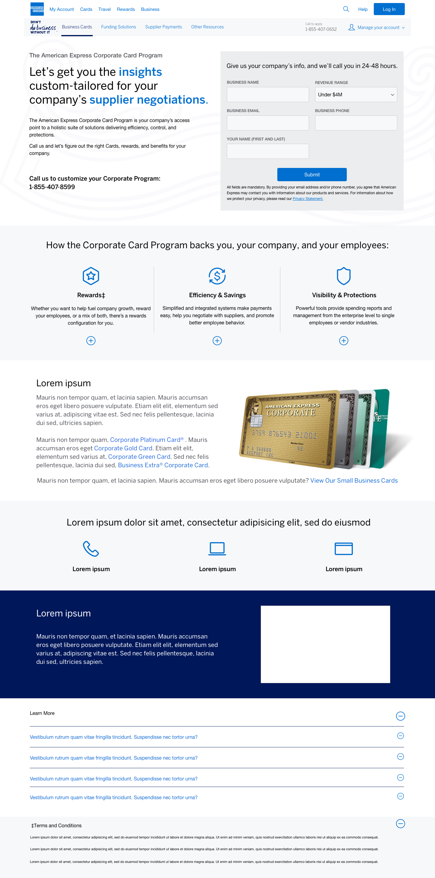
I would create five wireframe versions of the page.
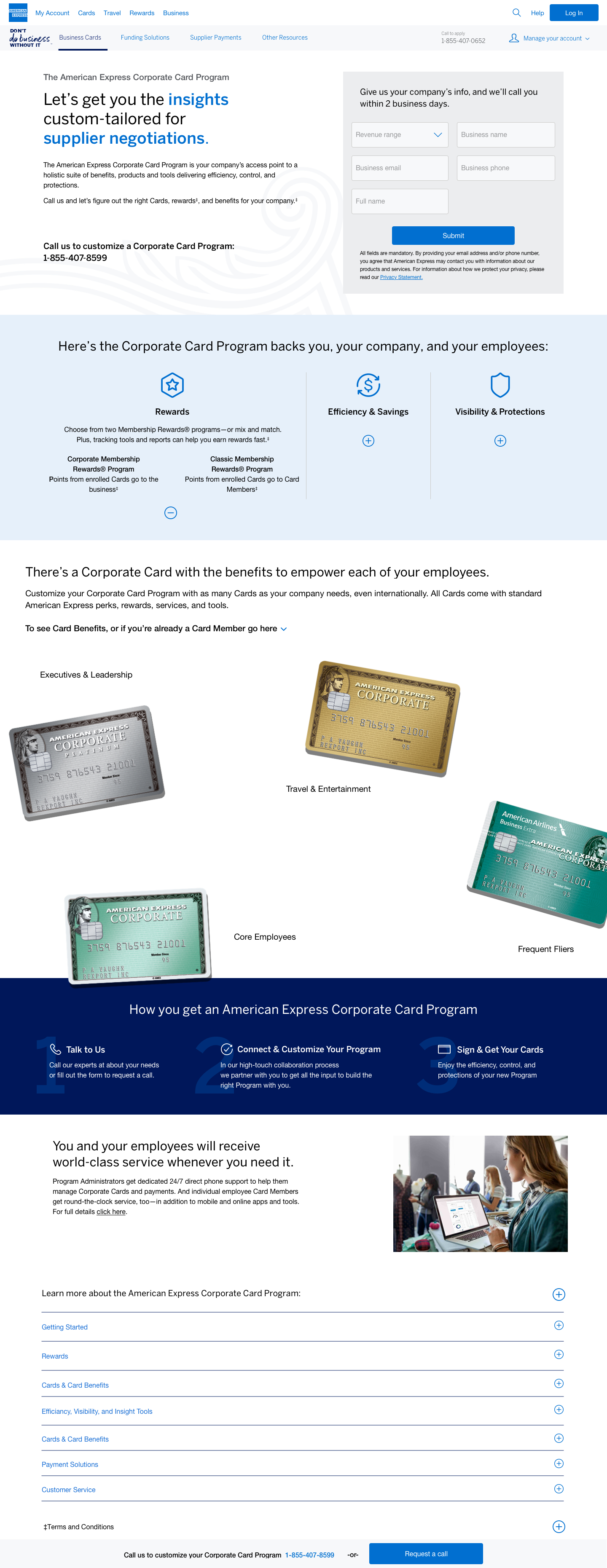
We agreed that the hero section isn't needed. The form on the right and text on the left explain the corporate card program.
Users can contact us by filling out a form.
The plus signs on earlier pages were a fresh, reusable, and inventive element for the American Express site.
Mid fidelity comps
The next step was to display the page layout to the stakeholders, and this is what they had to say:
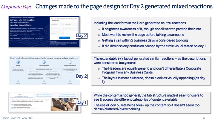
The left module didn't show cards correctly, confusing users with stacked cards.
Adjusted module layout: Process section moved lower, lead form made smaller on top for better alignment and readability.
Stakeholders picked the center module with a blue background and watermark to enhance the page for details on obtaining a corporate card.
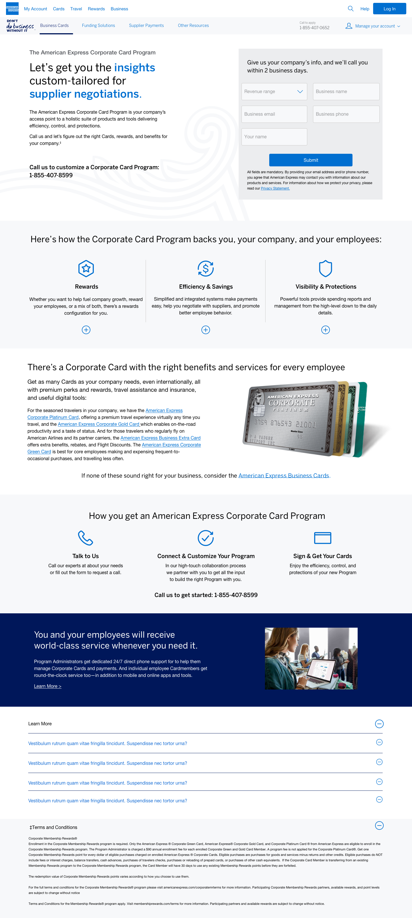
HIGH FIDELITY Comps
The team would improve the spacing and flow of the chosen page based on stakeholders' input (version A). Changes included:
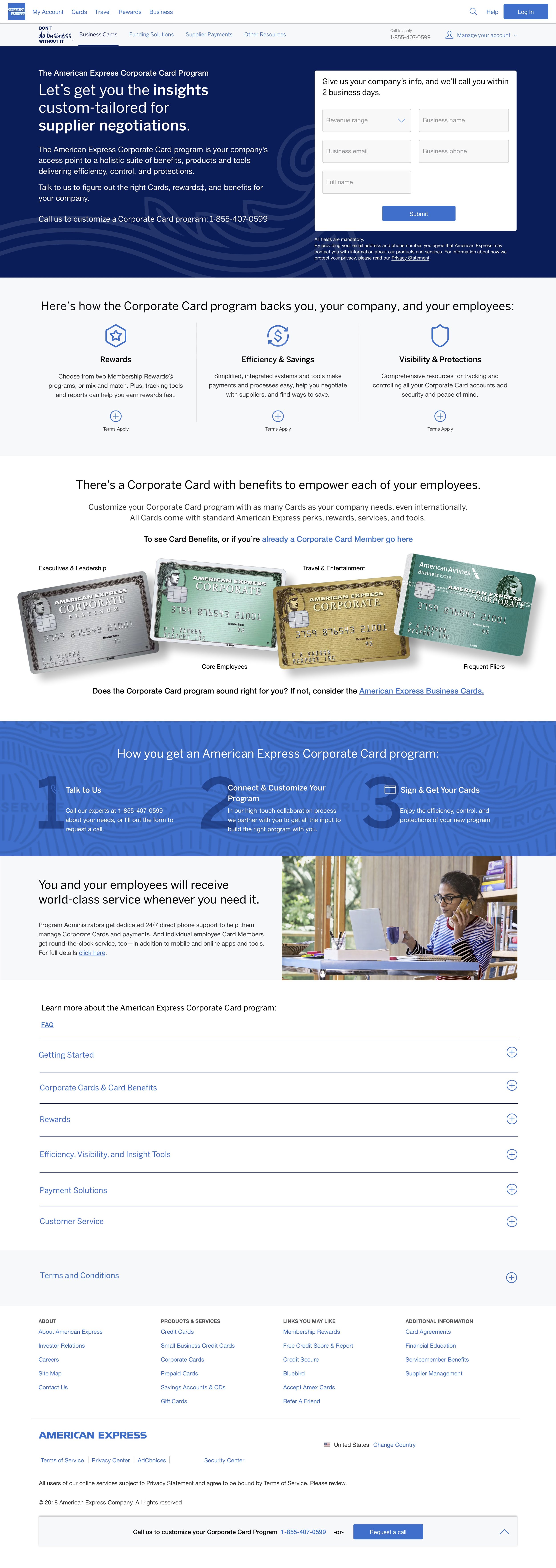
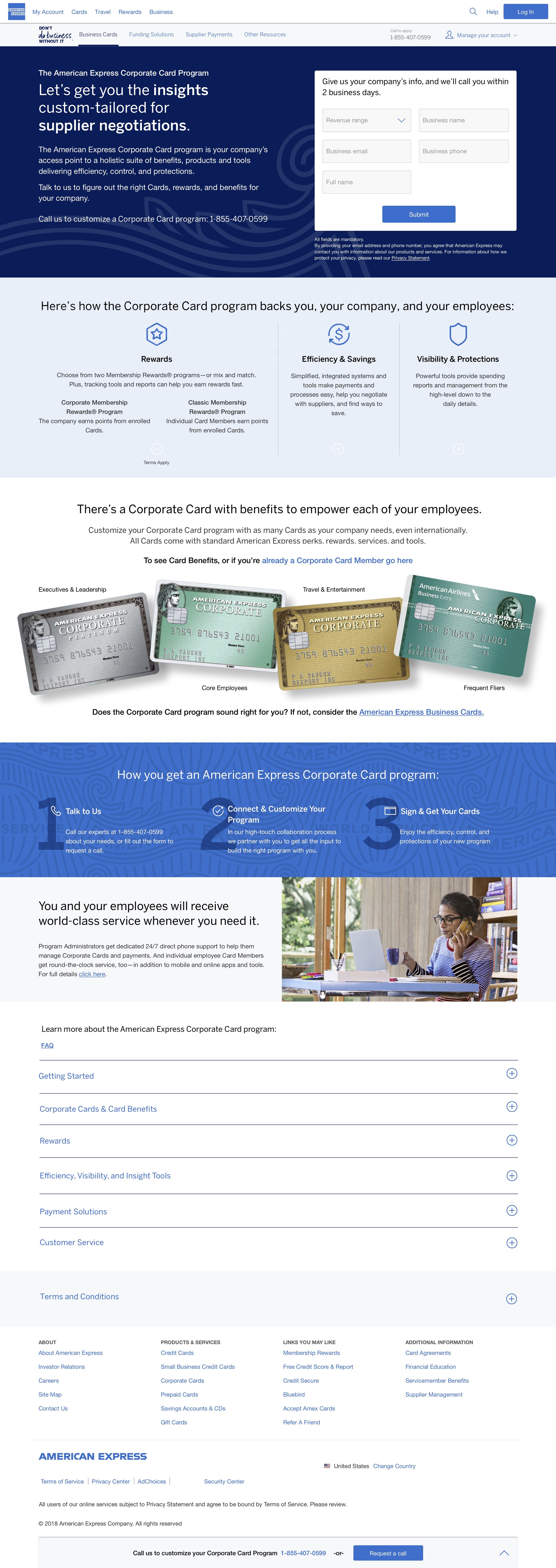
Update the top section to blue with the American Express heading. Dynamic white underlined words switch periodically.
The feature module was updated with plus and minus signs to show different features.
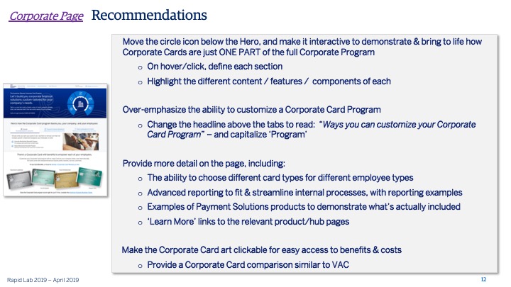
The cards module was completely changed to include a new layout that matches individuals.
The process module now has a new shade of blue with a watermark.
Why choose American Express? The image was also updated to show a freelance woman.
We included a sticky bottom navigation that pops up and moves with the user if they don't want to complete the form at the top.
User testing findings
The initial design had card images. Users wanted to click cards to learn more or compare, but the new Corporate Card Program doesn't allow online card selection.
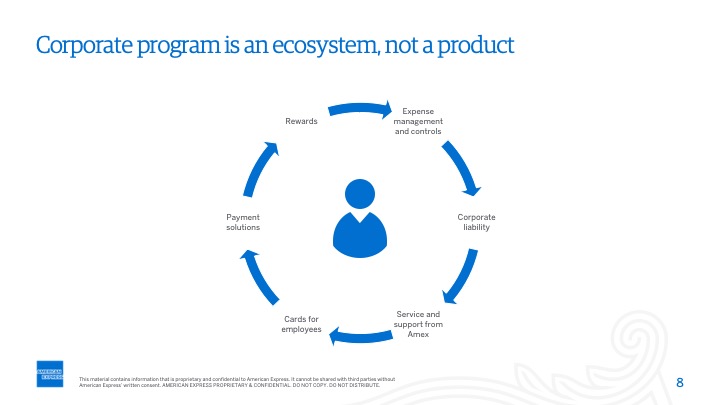
Users were disappointed because they couldn't interact with the ecosystem in the hero section, which they expected to provide more information.
Sketches
Collaborated on sketches with the UX Director, made improvements post-user testing, removed card art, and developed an interactive system. Explored individual module designs and their layout.
User feedback loop
After reviewing sketches and usability test feedback, I created new wireframe versions exploring various design layouts and content display options.
Final Iteration
The agile marketing team reviewed wireframes and chose a direction for the interactive ecosystem. Users can click icons to rotate the circle with changing information. Arrows allow them to navigate through info. Bold text in the hero header changes every 5 seconds.
Insights
After the page was constructed and subjected to live A/B testing, it was subsequently removed following the analysis of analytics which indicated a notable deficiency in user engagement. Insights gleaned from this endeavor underscore the significance of incorporating card art as users evidently value visual cues to discern available card options.


