Udacity
Udacity is an online catalog of vocational degrees and courses for professionals.
Project: Help creative UX team and product manager create wireframes and comps to be tested by users to eventually user tested on the Udacity website.
Role: I was tasked with researching user program searches and assisting them in deciding which program to choose in a four month span of time.
Target Demographic: User seeking continued education for the benefit of knowledge.
Research
When comparing competitors, U chose to research the pros and cons of each as provide an in depth audit as to how many steps a user must take to reach the checkout experience.
CBT Nuggets: Pros: diverse course selections, in-depth videos, instructors explain things well
Cons: website navigation, new content only available upon request
Coursera: Pros: partnered with educational institutes, certificates upon completion, large selection of courses
Cons: degrees cost money, prerequisites required
Coursera: Pros: course completion certificate, path development, offline & mobile downloads
Cons: progress up-date lags through courses, role assignments, lengthy videos
From here, I presented these findings to the Creative Director to see which direction we should take in revamping the Udacity experience.
Problem & how do users find new programs now?


Home page carousel: User lands on homepage and sees the carousel towards the middle of the page, can click in the schools and different programs.
Full product catalog: User lands on homepage and through top navigation finds the the full product catalog.
Navigation menu: User lands on homepage, click on programs and find from the list a program.

wiresframes desktop v1
From the previous section I looked into redesigning the existing experience for the user to better understand the filter and search process on the product catalog page.

wireframes desktop & mobile v2
After reviewing the findings with leadership, we selected which versions to test in order to keep our studies simplistic.
Tabs at the top depending what the user wanted to see i.e. all, nanodegrees, courses, free courses
Search bar
Filters across
Microinteraction card tile will switch from front to back to save room on the page
user testing Udacity vs competitors (Coursera)

User testing the existing Udacity website to Coursera to see how they differ and what users liked or did not like so we could implement changes to our site. In each case, the competitors websites the competitors websites offered the advantage of easy navigation, whereas Udacity did not.
Summary:
Participants were equally as confident in finding a class on Coursera compared to Udacity
When looking for classes on the Coursera platform, there were two distinct behaviors: use of the search bar and selecting a category before browsing
When looking for classes on the Udacity platform, there were two distinct behaviors: use of the search bar and browsing
There is an opportunity to increase visibility to the category search to assist users when they are browsing topics
There is an opportunity to expand the Udacity course catalogue and include more beginner and industry specific classes
High FIDELITY comps desktop & mobile v3
Below are high fidelity versions that are to be tested for reference.
The first image depicts shows the desktop with the microinteraction hover effect & search bar
A/B testing 1 across vs 2 across
Mobile version


User testing insights
I created a high fidelity version from the above version for the user to test via userzoom. This helped us to understand some of our assumptions how users are navigating the website. Below are some of the user testing insights that were gathered during our first analysis.
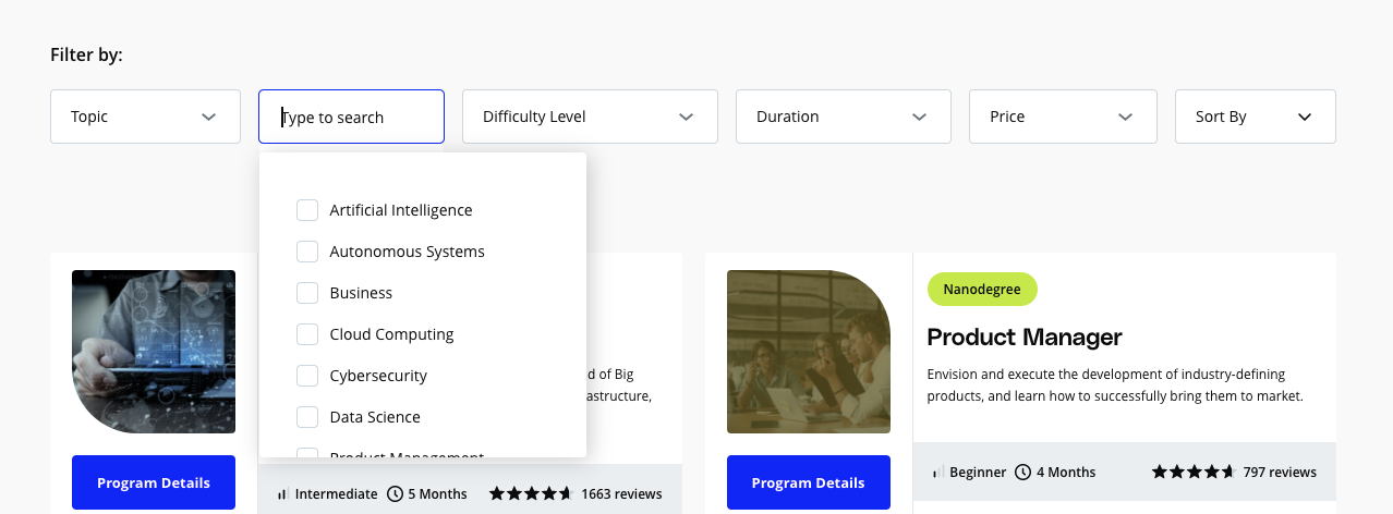
Users want to be able to filter AND sort programs by price
Users want to be able to see price on catalog cards
Users prefer not having content hidden
Users want more intuitive labels for the first three filters.
Suggest changing from: [ Skill ][ Knowledge Area ][ Difficulty level ][ Duration ]
To the following labels: [ Topic / Skill ][ Field / Career ][ Experience ][ Duration ]
Add a ‘Clear All’ option so users can clear previous filter selections:
Users want ways to sort courses by how “established/developed” they are. Suggest adding the ability to sort by “Most Reviewed”, “Highest Rating”, and also “Price”, “Duration”
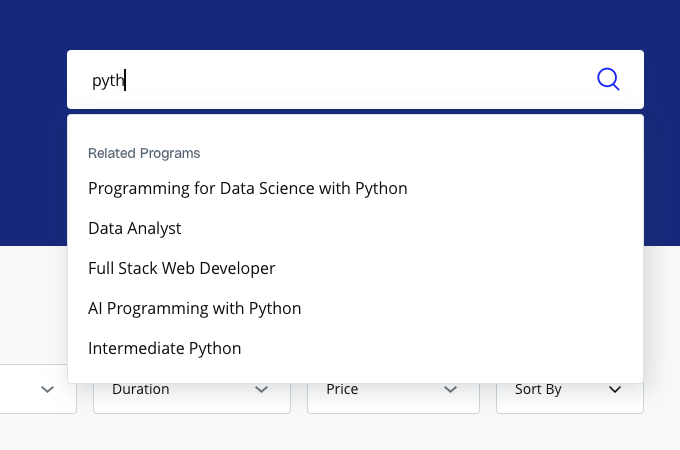
Users are confused by the search result labels “Most Popular Programs” and “Most Popular Searches” Recommend changing the first label to “Related Programs”, and possibly omitting ‘Most Popular Searches” entirely, depending on whether it’s technically feasible/practical (TBD).
A/B Testing
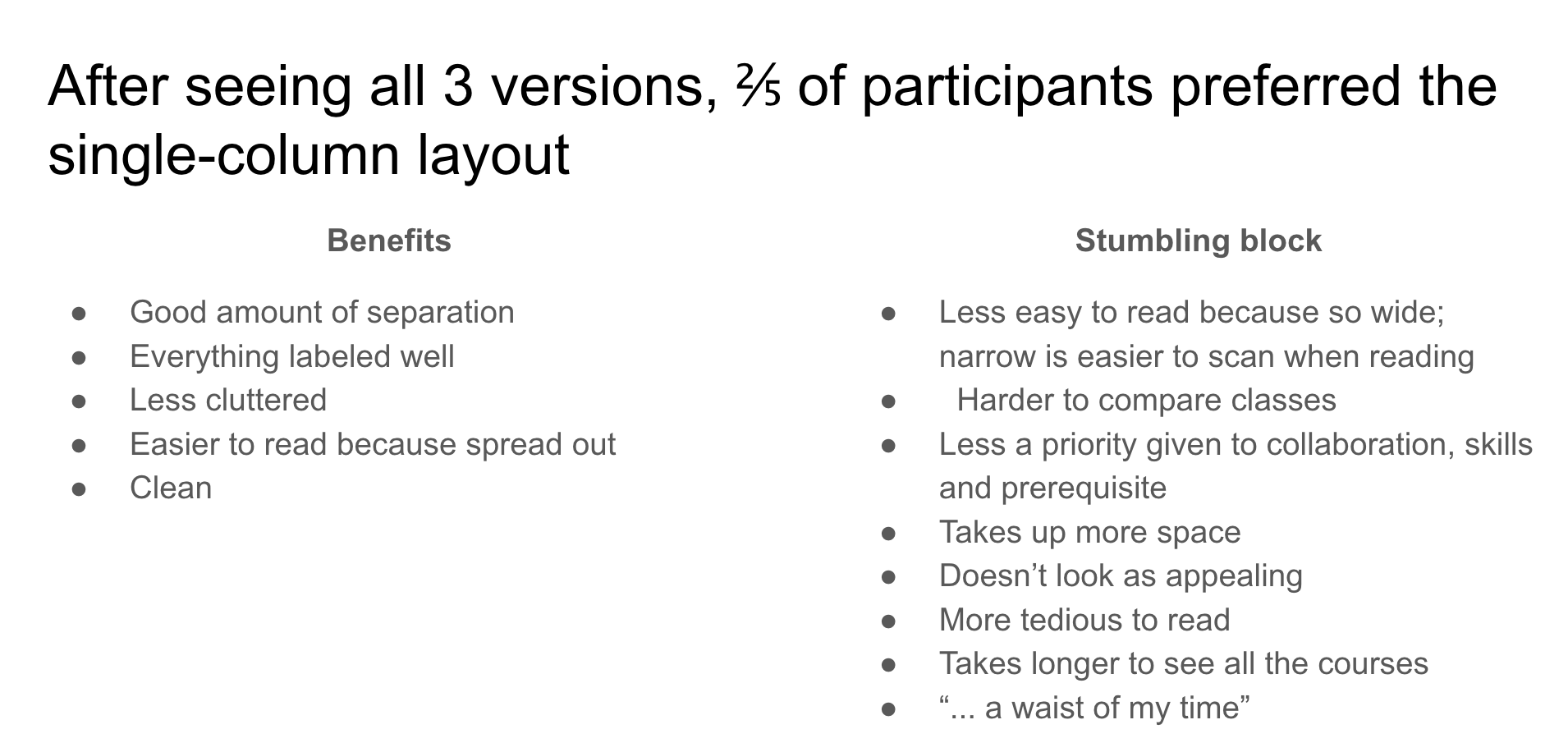
One of the more interesting tests we did during analysis was finding that users preferred 1 column vs 2 column layout (with hover).
*They would not switch all at the the same time that was InVision error so this may have skewed results slightly.
2/5 participants preferred the single column layout but it has more cons than pros i.e.not being able to scan the page as quickly.


final insights
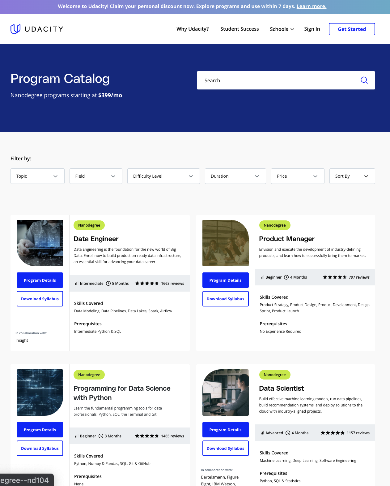
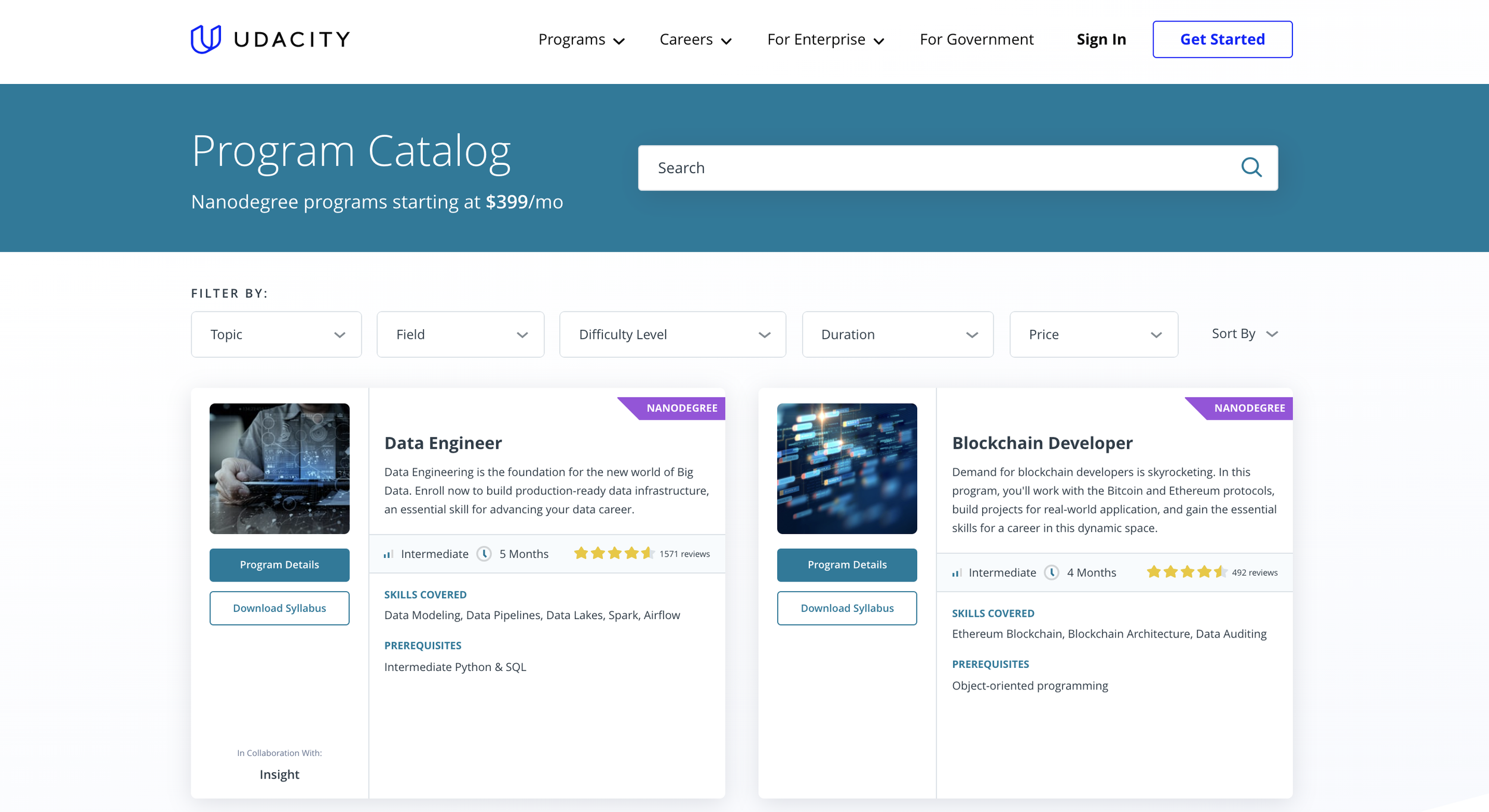
Udacity recently did a rebrand on the entire website, but from the findings and user testing we decided to implement some of the features from the project.
Search bar at the top (this is now slightly to the side instead of taking over the entire width
Filters added to the top for users to find what they are looking for faster/easier
Chips added to each card in different color to differentiate what type of program it is i.e. nanodegree, course, free course
Card tile info remains the same as user testing shows that users wanted to see all of the info